- Company
- CI
CI

Symbolic meaning
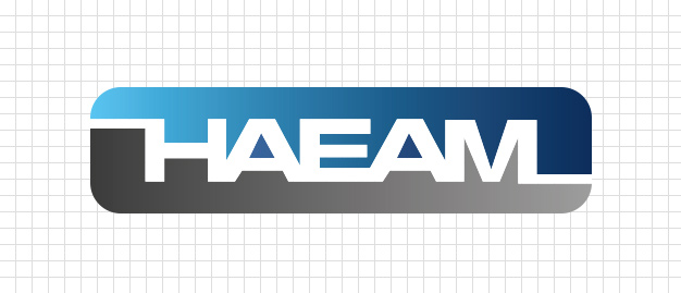
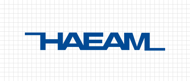
The term 'Hae-Am' (해암) refers to rocks in the deep and wide ocean, both above and below the surface, and signifies strength, depth, and inclusiveness, emphasizing the importance of not overlooking what may not be immediately visible. The symbol mark of Haeam Tech Co., Ltd. serves as the most important element of the company's CI system, representing the company's highest visual element and strongly appealing to the naming of HAEAM in English. The even logo type contains the implication of a firm leap forward, and the color above the logo represents Haeam, which has a higher level of technological expertise than its competitors and is constantly developing, while the gray below represents the industry. Furthermore, the combined connection in the English symbol logo represents the unity of Haeam, and the lines drawn on both sides represent communication, which is the most direct means of recognizing Haeam Tech Co., Ltd. externally.
Type of Logo
Symbol Color
Main color
- C70 M40 C100 M80 Y20 K40
- 적용색상:별색 PANTONE 287 CV 2
- K90~K50
Assistant color
- K100
- K80
- K50
- K10
- C100
- C85 M82 Y68 K26
- C50 M25 Y0 K15
- C70 M25 Y0 K80
- White
Download
CI download- Address 18, Gomjeol-gil 9beon-gil, Seongsan-gu, Changwon-si, Gyeongsangnam-do, Republic of Korea
- Tel +82-55-238-2213
- E-mail haeam7@haeamtech.com
Copyright ⓒ 2023 HAEAM TECH. Co., LTD.. All Rights Reserved.


